|
|
|
White Rock, BC
 There are 7 WHITE ROCK PIER PAINTINGS in total, several of which are displayed on this page. As each one is released as a Limited edition print, it will appear on this page; images V, VI, and VII are very much in process (as of April 2006), and the entire 7 images will be on this page by the end of 2006.
I'm not sure how or when my fascination with the structure of the pier started; perhaps it was at age 5, when, after dropping out of Kindergarten from boredom, it was announced that the class was going to take a train trip to White Rock (all the way from the very rural Coquitlam...here I betray my age). Nice of them to tell me this AFTER I dropped out! But, faint heart never won fair lady, so of course I screamed and yelled and generally made sufficient noise, so the teacher relented and let me go on the train trip. That was the first time I'd seen White Rock, and like most kids, probably couldn't have cared less about some big wooden brige-thing sticking way out into the ocean...but that big white ROCK....now, THAT was something!!
And no, I didn't ever go back to Kindergarten......something with being told what to do all the time.....
Another significant White Rock memory was the first time I saw a painting by Brent Heighton; while doing the usual stroll along Marine Drive, in the front window of a gallery was one of Brent's fabulously loose and brilliantly colorful floral watercolor images, and I was mezmorized. This was 25 years ago at least, and I was only just starting to fuss my way through my first baby-steps into watercolor painting. I had never seen painting like this. I recall walking out to the end of the pier and back, for once not being in any way aware of my surroundings, but aware of one overriding thought..or more likely, one feeling...THAT is how I want to paint...not necessarily to copy the style, but to be able to capture the feeling and intensity Brent was able to. Of course, how was I to know that just about every other painter in watercolor, or for that matter, in any medium, was thinking pretty much the same. All that I knew for sure, as I walked back in off the pier, was, that if I wanted to do more than just fiddle around as a painter, I had just come fully head-on with just how good good really was, and that aiming for anything less than that type of excellence was a waste of my time.
|
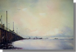 The Pier at White Rock This image of the pier was a composite of a number of different sketches and vantage points, and I was taken by the severity of the fading point of perspective and centre of interest. This original was a 22 x 30 watercolor, and painted not long after a spent a weekend workshop with Brent Heighton; this was the point I put large and sloppy brushes into my hands, as well as a spray bottle, to augment a really loose and random rendering, the sort of thing watercolor excels at. I think in the hands of skilled watercolor painters, whether executed very loosely or very tightly detailed, the potential for the impossibly beautiful exists at these two ends of the spectrum. The Pier at White Rock This image of the pier was a composite of a number of different sketches and vantage points, and I was taken by the severity of the fading point of perspective and centre of interest. This original was a 22 x 30 watercolor, and painted not long after a spent a weekend workshop with Brent Heighton; this was the point I put large and sloppy brushes into my hands, as well as a spray bottle, to augment a really loose and random rendering, the sort of thing watercolor excels at. I think in the hands of skilled watercolor painters, whether executed very loosely or very tightly detailed, the potential for the impossibly beautiful exists at these two ends of the spectrum.
This painting was my first image reproduced with the new (then) technology of GICLEE printing. |
| "The Pier at White Rock" Limited edition 50 image size 28x20 |
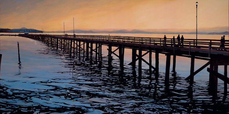
| The Pier at White Rock 2 acrylic image. This is now released on canvas. |
| "The Pier at White Rock 2" image size 2'x4' original and in print |
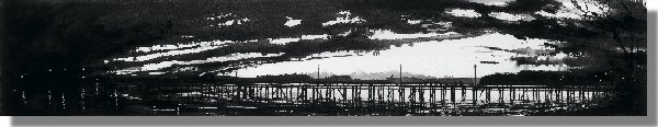
White Rock III In the fall of a few years back, I travelled from my Physio clinic in Langley to White Rock every Wednsday afterwork, for 8 weeks in a row, aiming to catch the pier in a variety of lights and moods, and usually made it there by around 6 - 6:30 pm. I had gone to a canvas/sail manufacturer to have a 12" x 72" canvas made for a concept I had/have been thinking about for years; a long and narrow pier image wasn't a new concept, but I wanted it to be reeeeealllly long. On one of these evenings, I got there just a bit to late, and missed a gorgeous sunset, but decided to take pictures of the last few seconds of it. Of course, these were quite dark, and almost void of color, but the shapes were intriguing. Around this time, the Federation of Canadian Artists were calling for images for their annual BLACK AND WHITE juried exhibition, so this painting came together for that show. The show was in the Spring, and the painting then hung in the GRANVILLE ISLAND HOTEL, for the summer. The painting was done in Acrylic, but rendered on watercolor paper, and is now reproduced onto canvas. |
| WHITE ROCK III 6 x 18 black and white acrylic (printed a month ago) |
 Part of the FCA 2004 year-end juried show
SMALL, SMALLER, SMALLEST, Dec 14 - 24, 2004. Part of the FCA 2004 year-end juried show
SMALL, SMALLER, SMALLEST, Dec 14 - 24, 2004. |
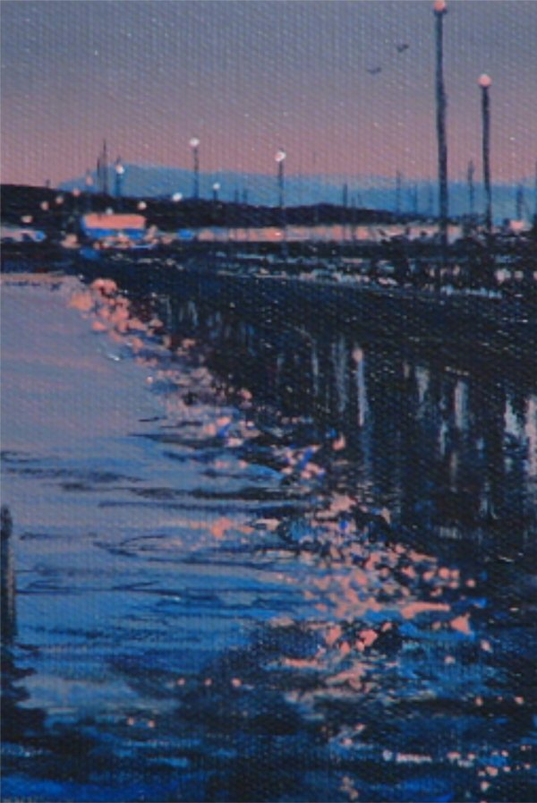
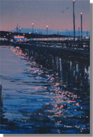
| Whiterock Pier IV is a 4"x6" Acrylic |
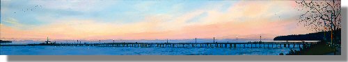 |
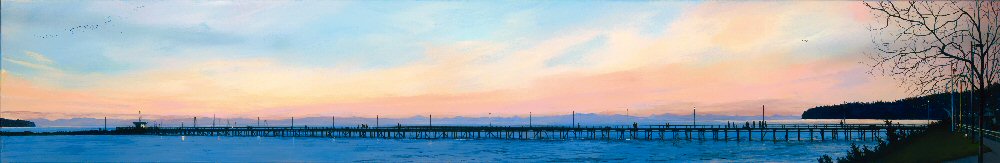
| Whiterock Pier 7 is new 12"x72" Acrylic |
|